
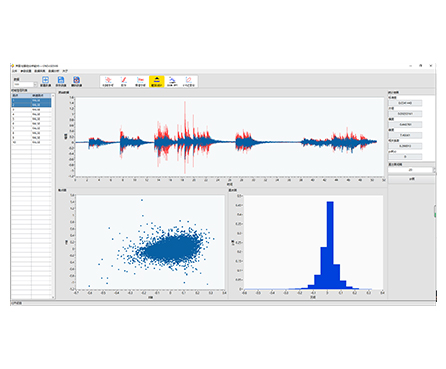
HP-STAP Probability & Statistical Analysis Software provides practical tools for probability data analysis, including scatter plots and histograms. It helps engineers quickly understand data distribution, identify trends in regression analysis, and choose an appropriate model for curve fitting.
| Probability-focused analysis | Includes probability data tools for quick statistical interpretation |
|---|---|
| Scatter plot for regression insight | Visualizes data points on a Cartesian plane to reveal relationships between variables |
| Trend discovery for curve fitting | Scatter plots show the overall trend, helping you select an appropriate fitting function/model |
| Histogram distribution reporting | Uses histogram charts to clearly present how data values are distributed |
| Faster engineering decisions | Quickly confirm variability, outliers, clustering, and trend direction |
Series: HP-STAP
Product Type: Probability & statistical analysis software
Core Functions:
Probability data processing
Scatter plot visualization
Histogram (distribution) reporting
Regression trend observation and model selection for fitting
When you are validating test results or investigating signal features, you often need to answer two questions fast:
How is the data distributed? (Histogram / probability view)
Is there a relationship or trend between variables? (Scatter plot for regression insight)
HP-STAP combines these key statistical visuals into one workflow so you can interpret patterns quickly and support engineering decisions with clear, report-friendly charts.
Regression exploration: relationship checks between input/output variables
Test data evaluation: stability, consistency, and distribution review
Quality control: compare sample distributions and detect abnormal spread
Reliability screening: observe dispersion and data clustering trends
Reporting: create clear plots for technical reports and validation documentation
(Kept general to avoid adding specs not shown in the image.)
Works with numeric datasets produced by measurement/testing workflows
Suitable for analysis of engineering variables where distribution and regression trends must be visualized
(Listed as capabilities/outputs based on the image content—no invented numeric limits.)
Probability data analysis
Scatter plot output (data point distribution on Cartesian coordinates)
Regression trend visualization (supports selecting a suitable fitting function/model)
Histogram chart output (statistical distribution reporting using vertical bars)
Q1: What is a scatter plot used for in this software?
It shows how data points are distributed on a Cartesian plane—commonly used in regression analysis to visualize relationships and trends.
Q2: How does the scatter plot help with curve fitting?
By revealing the overall trend of data changes, it helps you decide what type of fitting function/model is most suitable.
Q3: What does the histogram show?
A histogram is a statistical report chart that uses bars to display how data values are distributed (frequency across ranges).
Q4: Is this tool only for statistics experts?
No. The focus is on clear visuals (scatter + histogram) so engineers can interpret trends and distributions quickly.
Q5: What kind of results can I export into reports?
Typical outputs include scatter plots for regression/trend interpretation and histograms for distribution reporting (export options depend on your software build).